

Brace Yourself for That Late Nineties Oval
The shape that quietly branded an entire era.

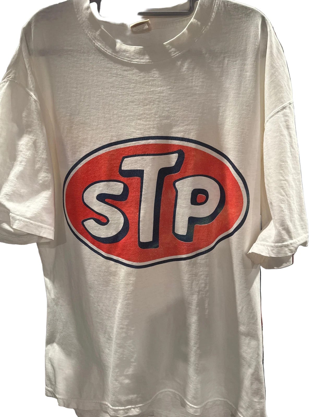
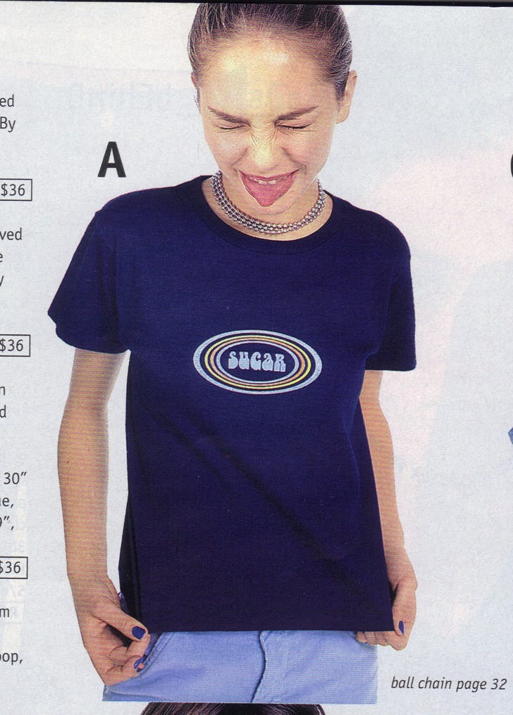
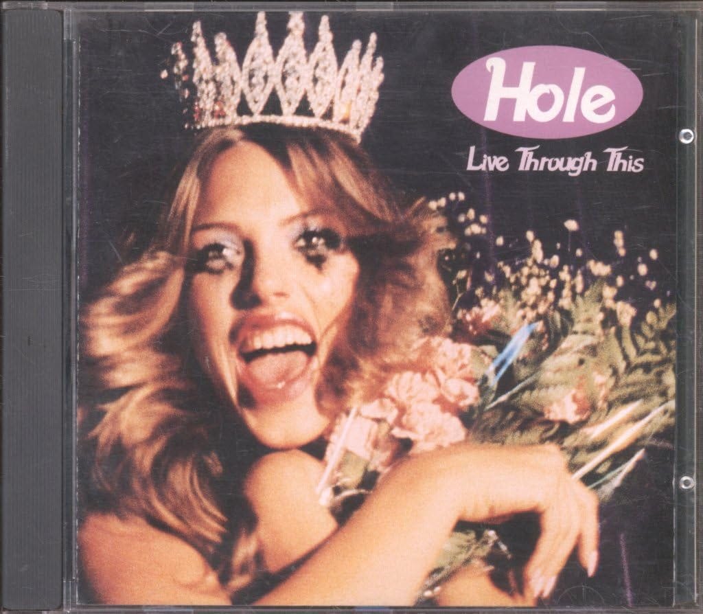
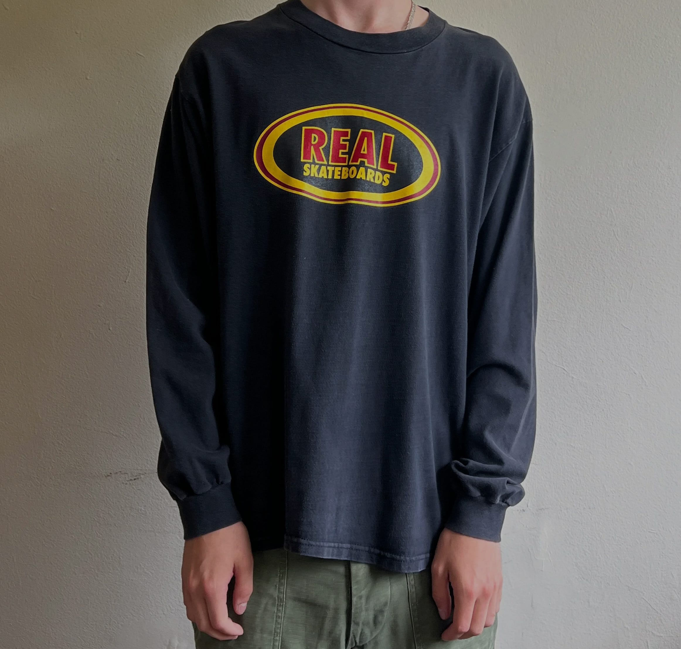
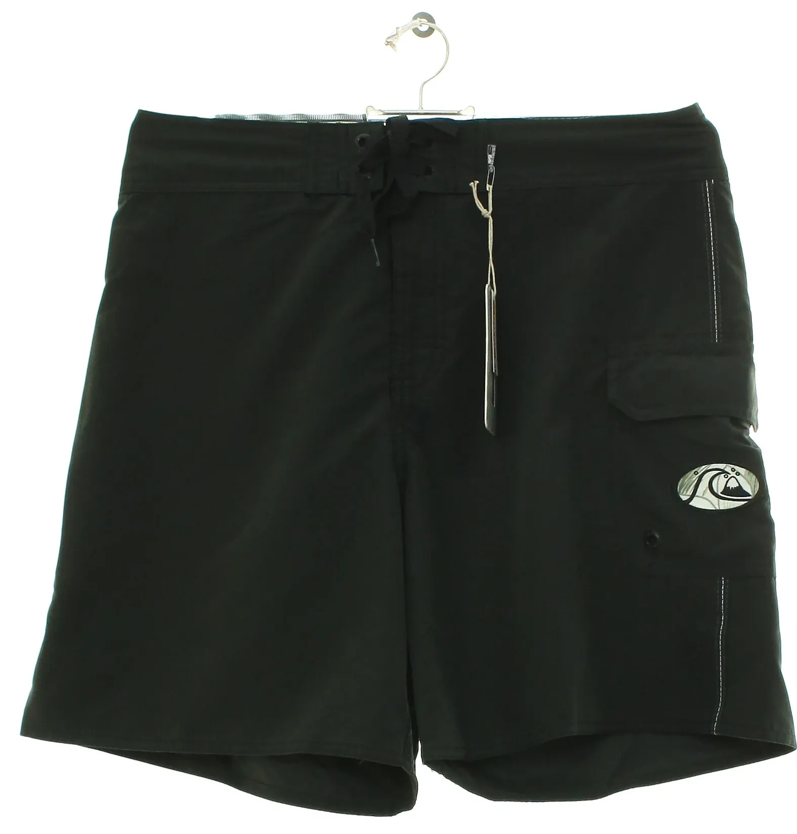
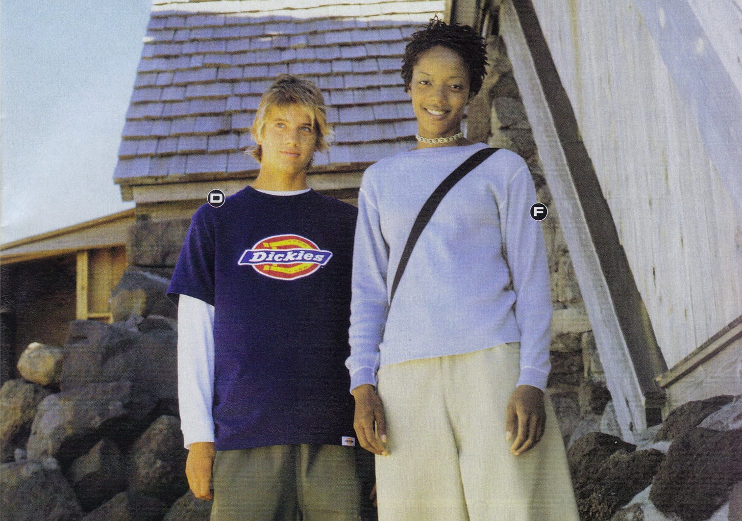
Nostalgia for ’90s style feels like it’s at an all-time high. There’s plenty to love, like JFK Jr. & CBK’s green Saab and the heyday of print magazines, but there are also visuals flooding in that feel like a migraine. Somewhere on that ’90s spectrum is a single shape that helped define the graphic design of the era: the oval. I have no idea why ovals were so strangely dominant in late ’90s branding, but one theory is that the shape was a softer response to the rigid grids and boxes of ’80s corporate logos. Or, maybe it just happened organically and then it was copied over and over. Either way, they’re back as the ’90s resurgence expands and deepens.
I guess life is just a (flattened) circle.
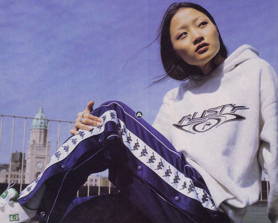
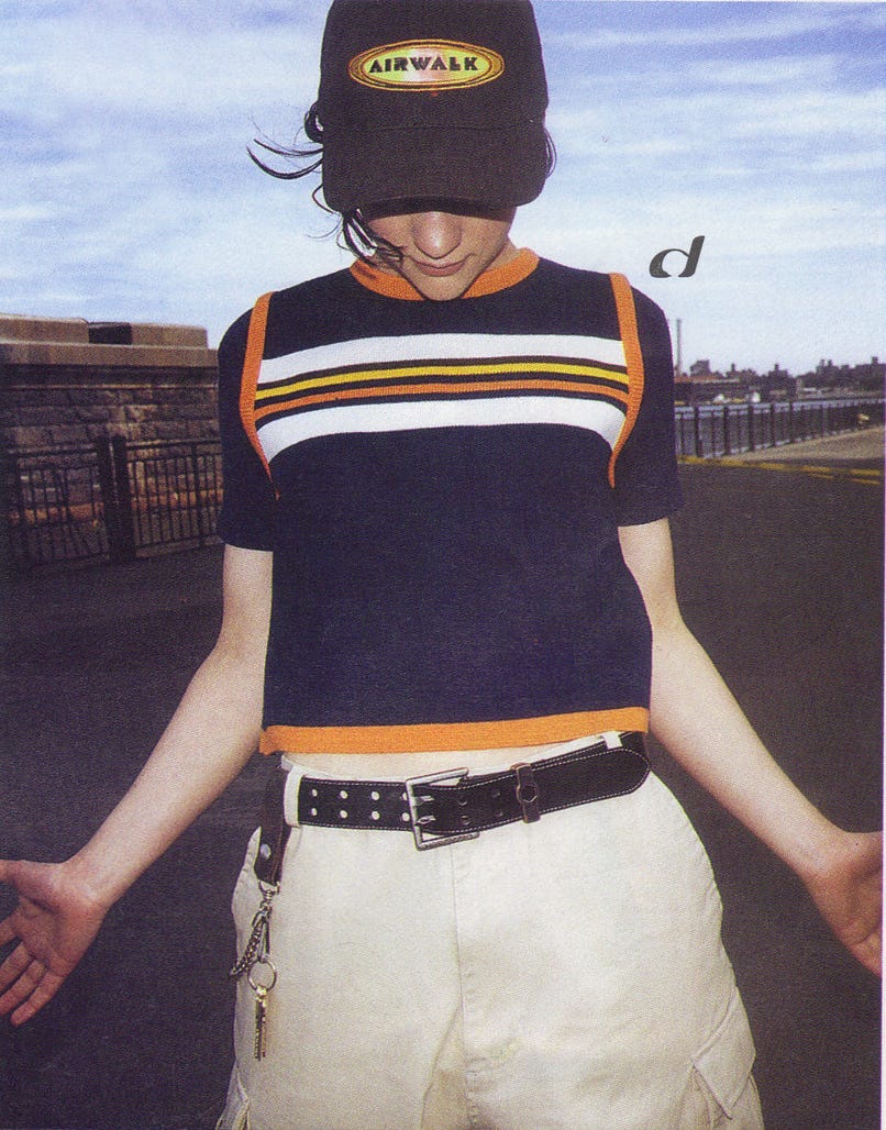
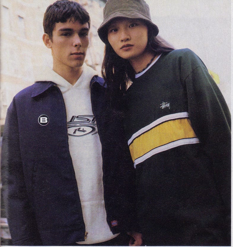
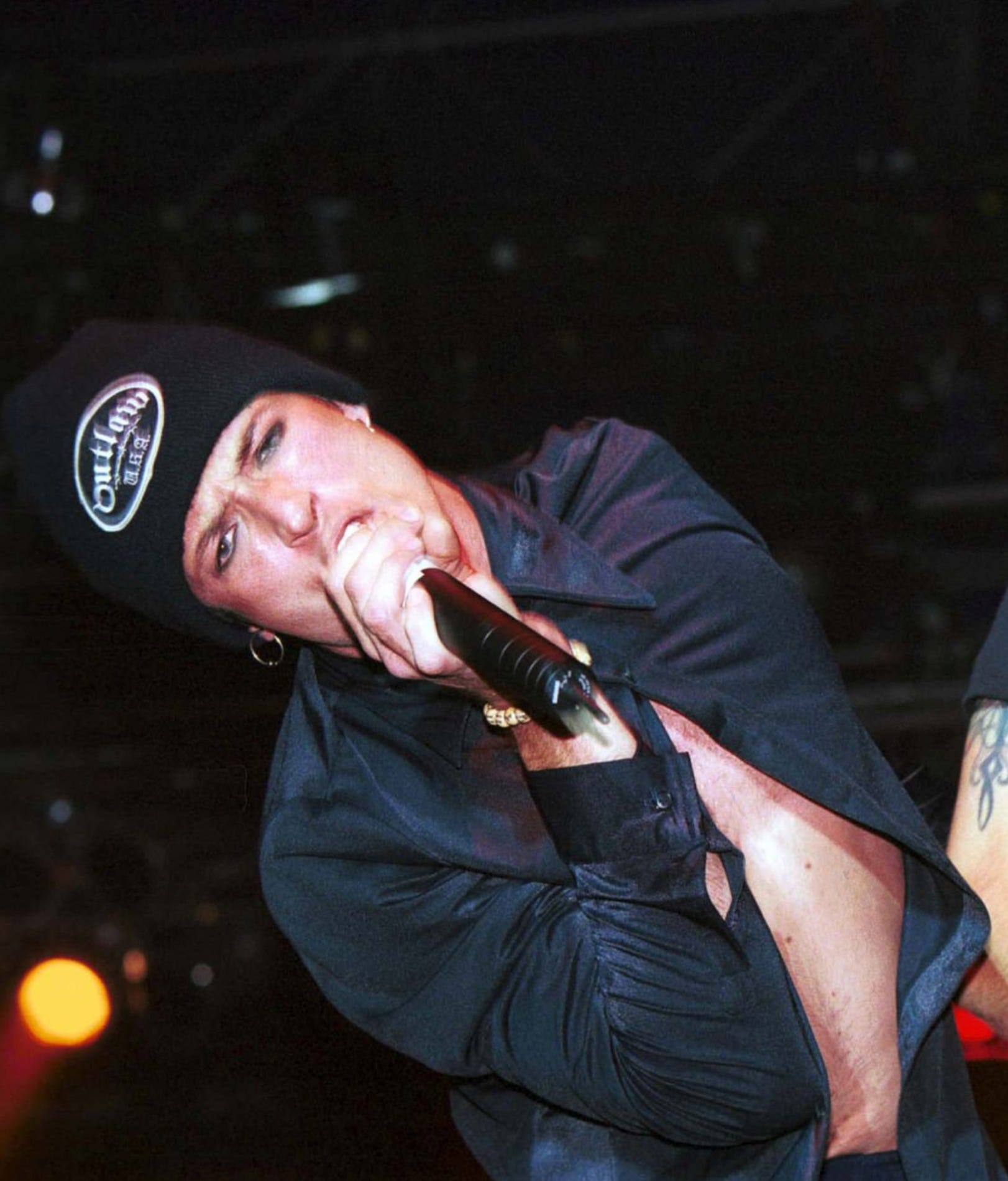
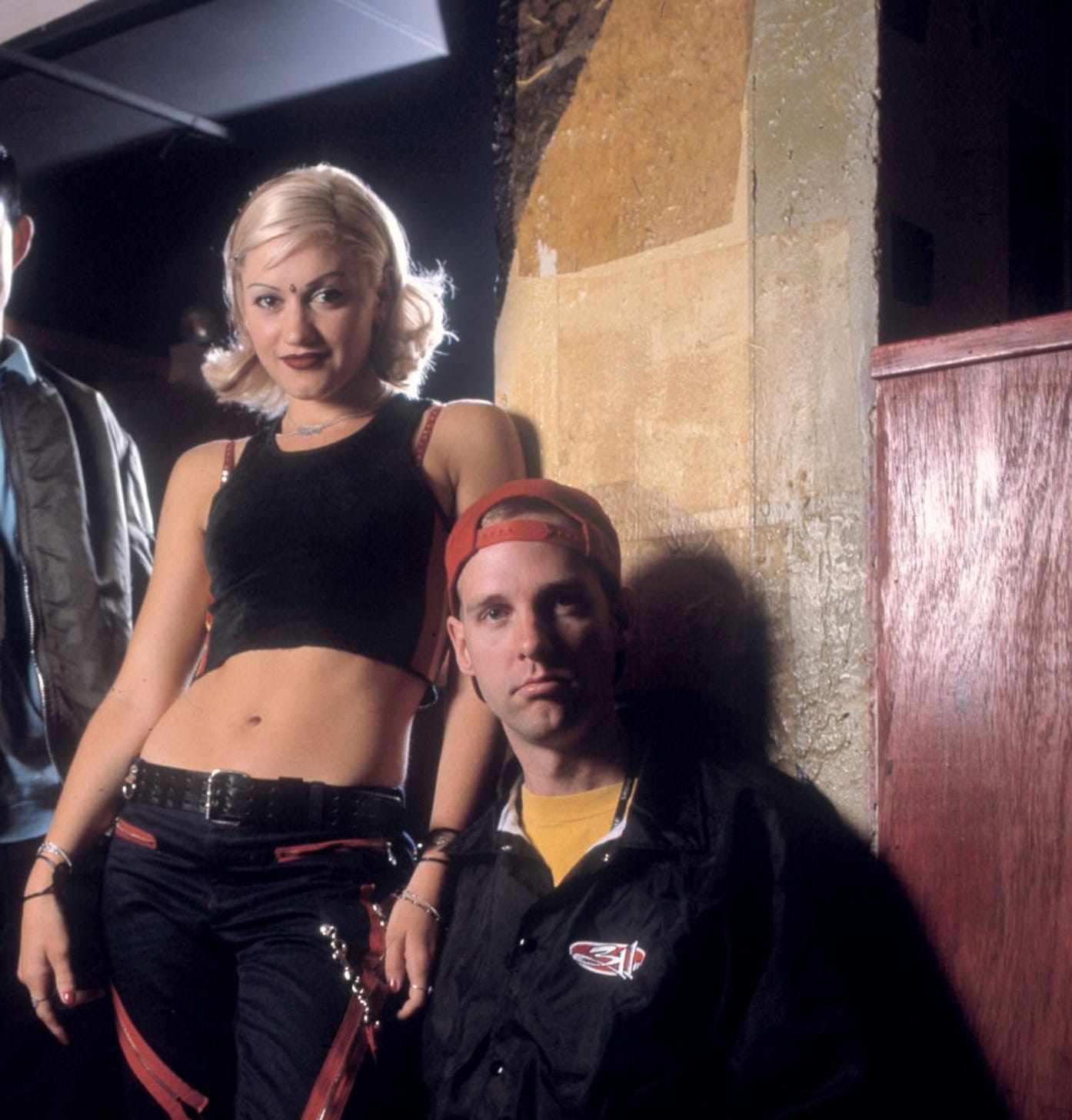
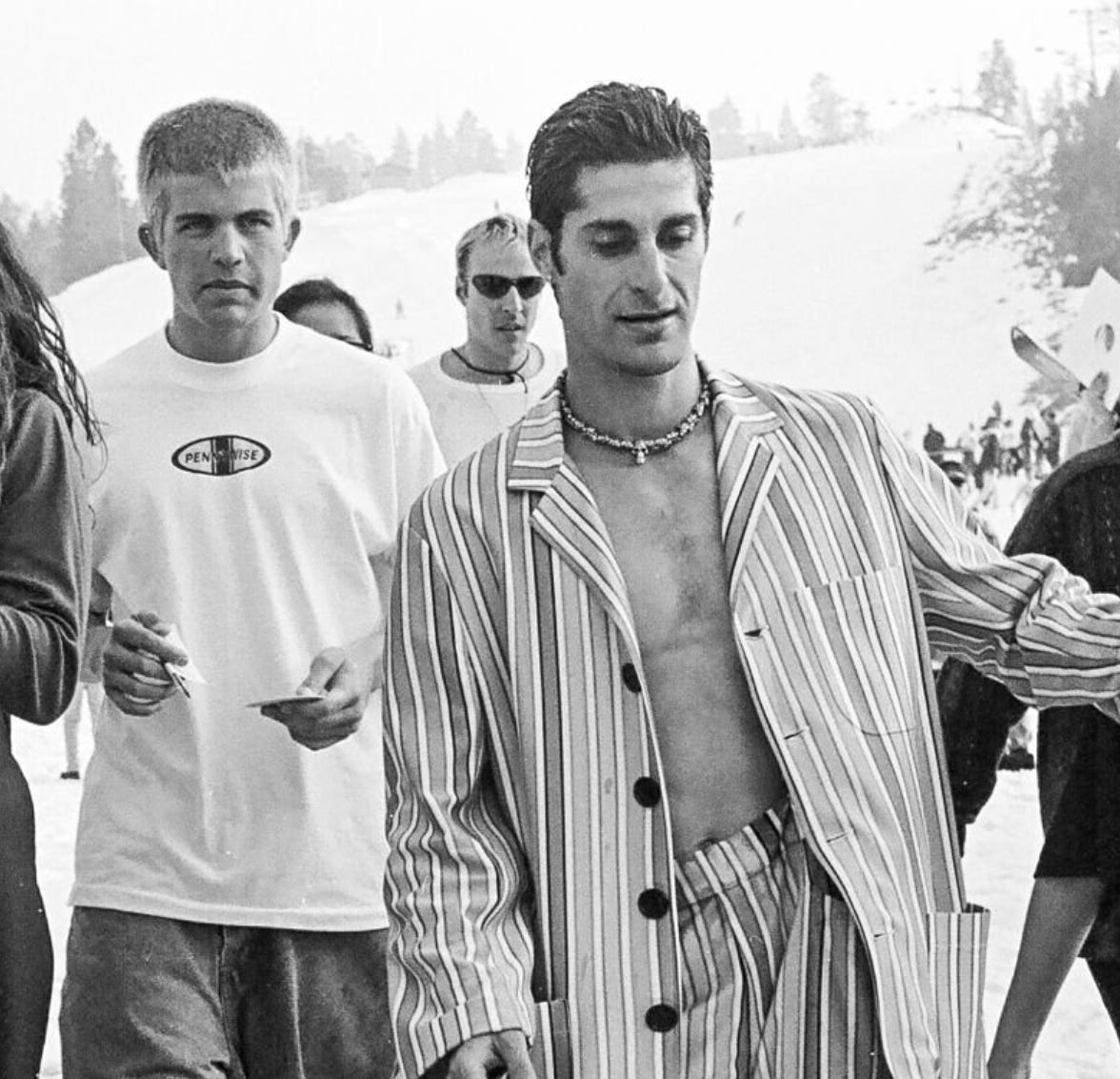
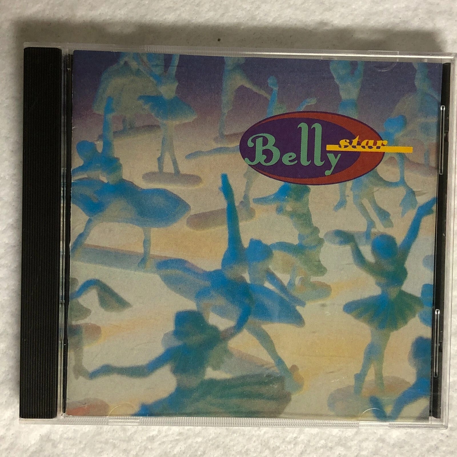
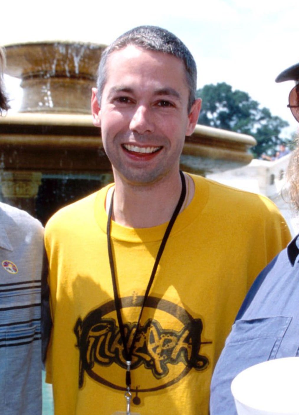
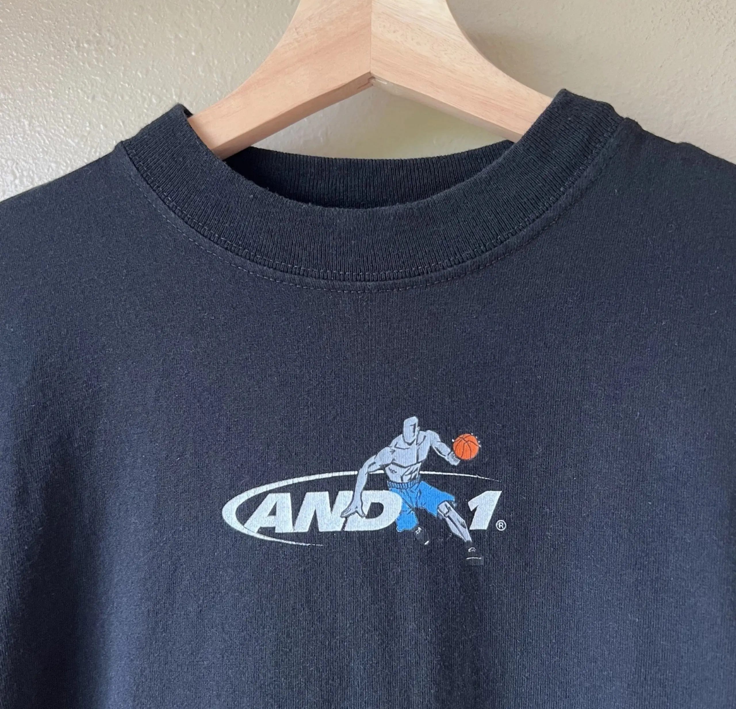
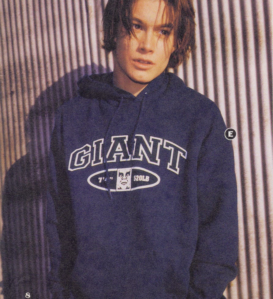
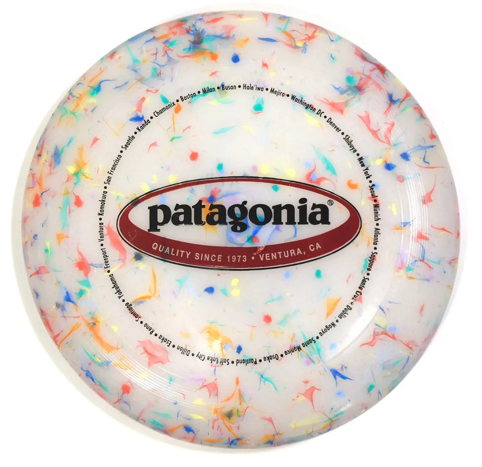
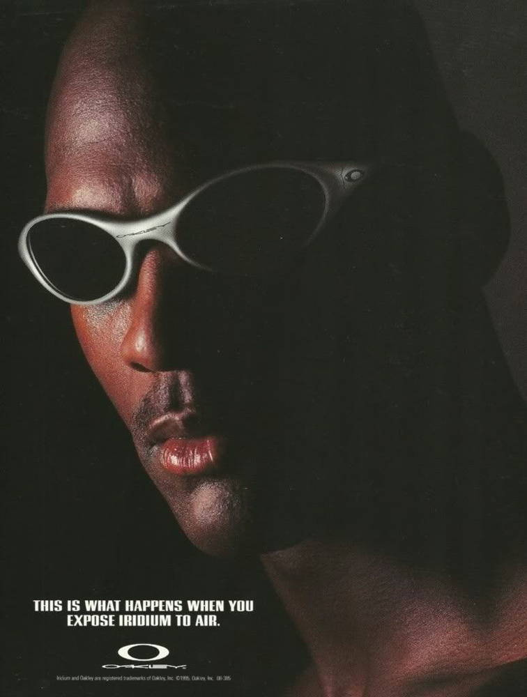
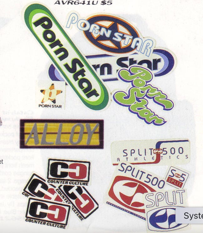
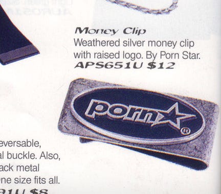
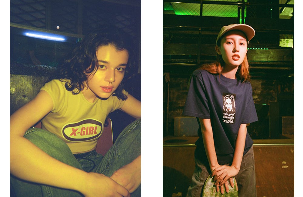
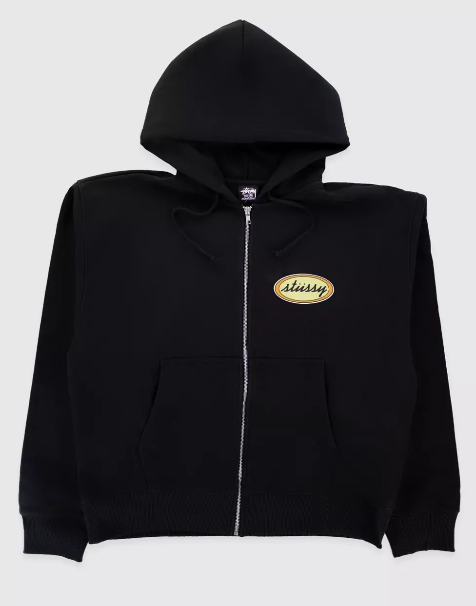
A Visual Oval Origin Story (1996-1999):


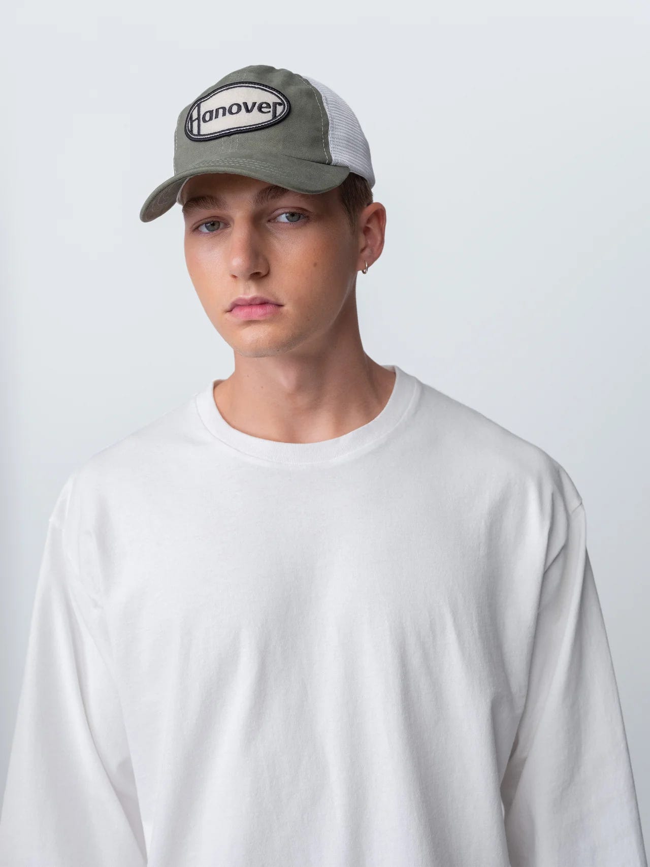
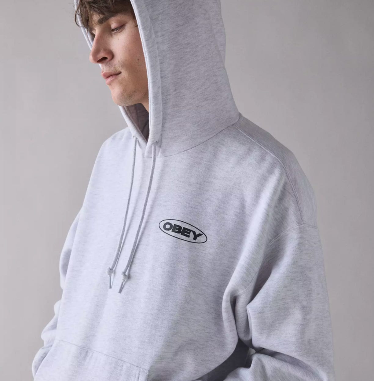
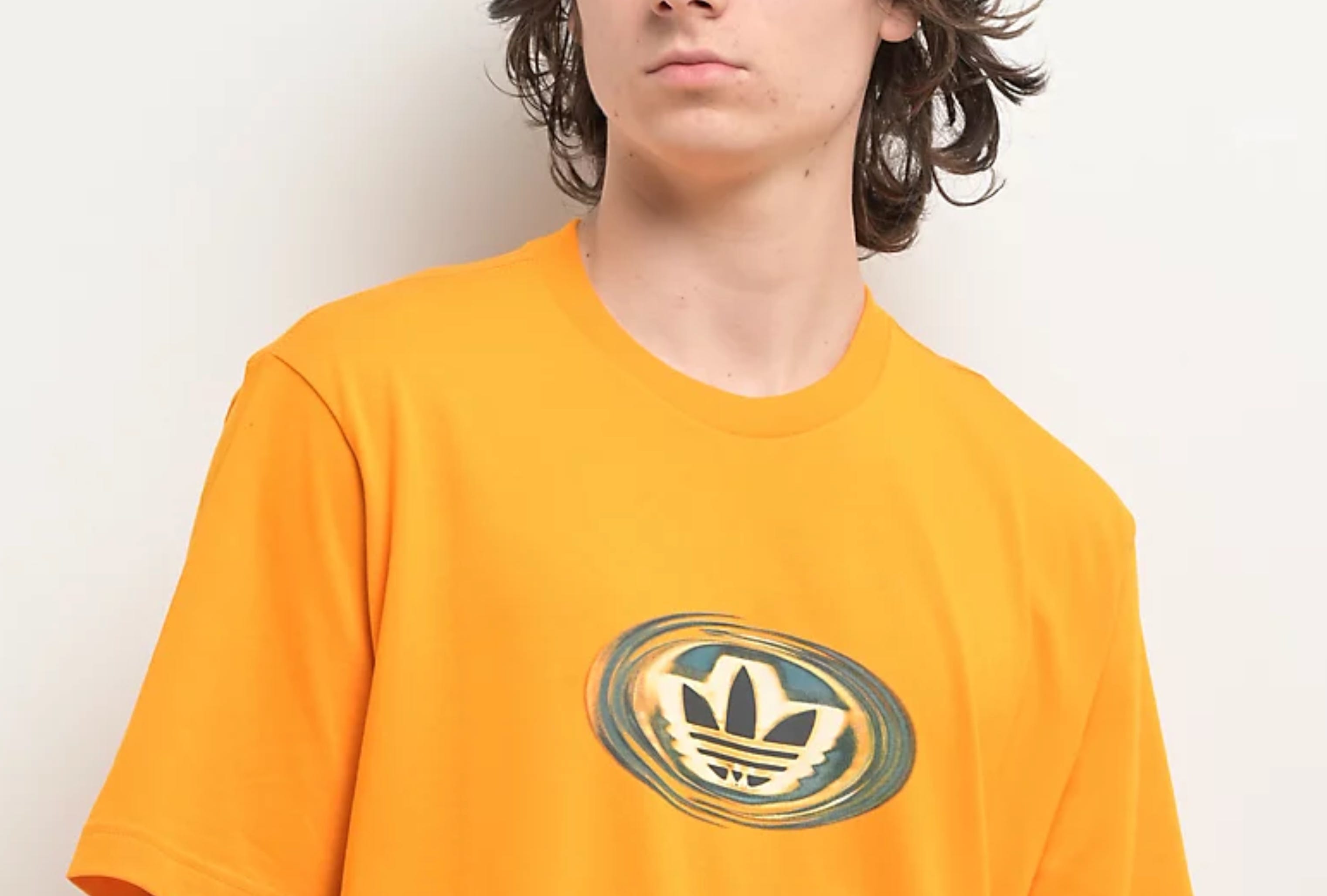
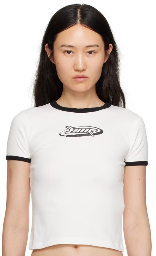
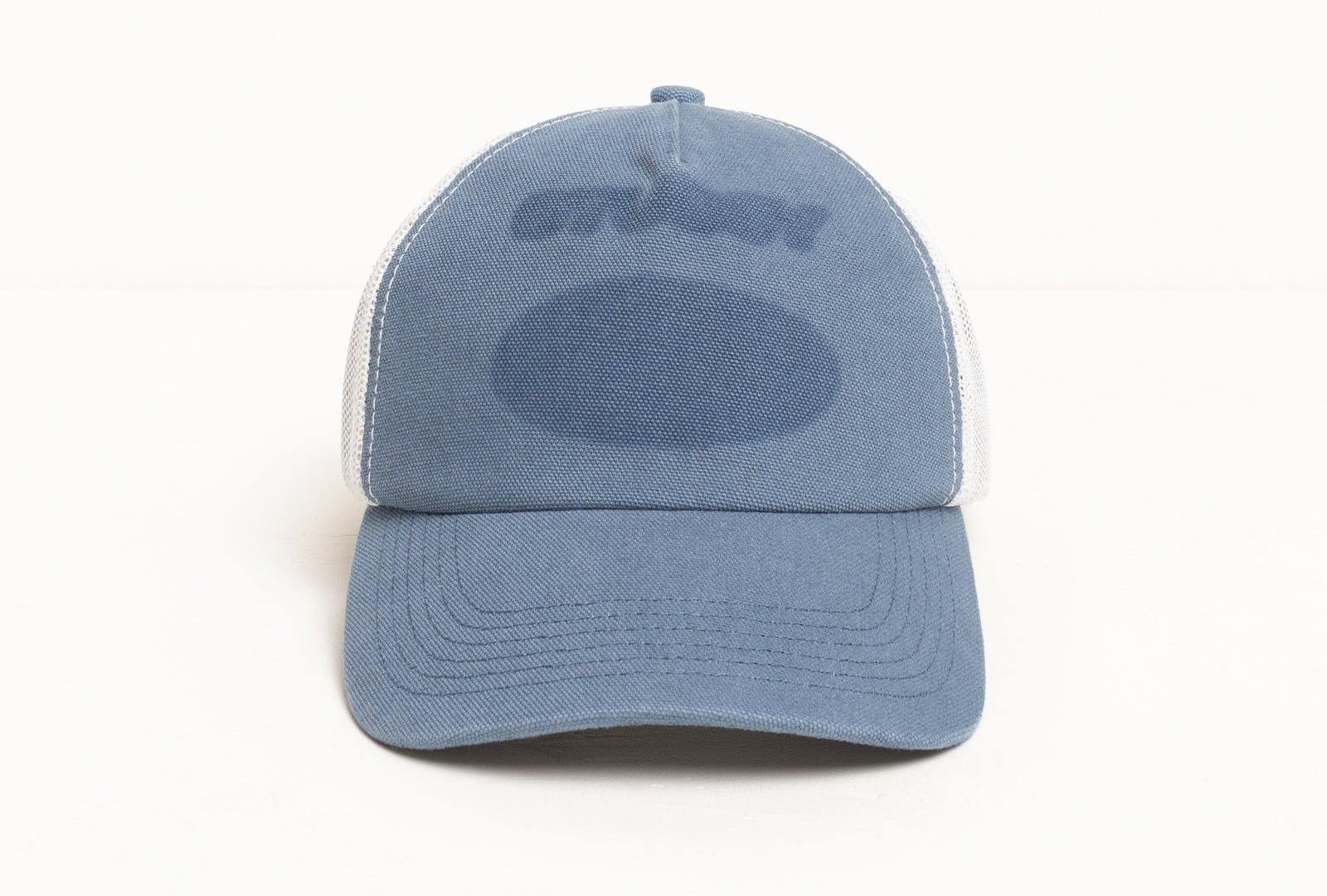
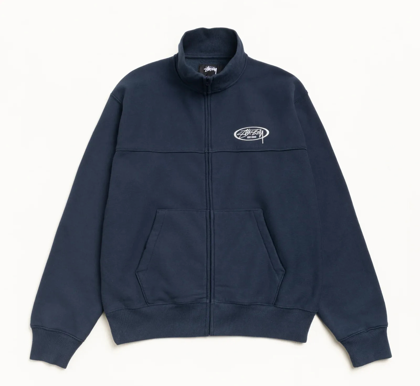
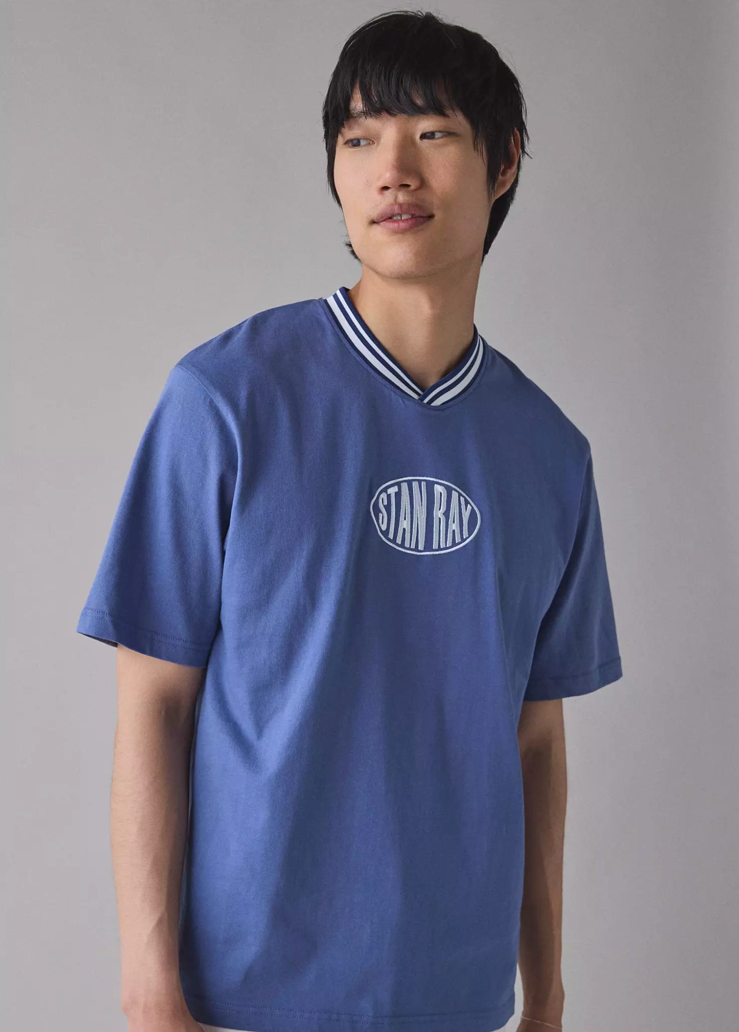
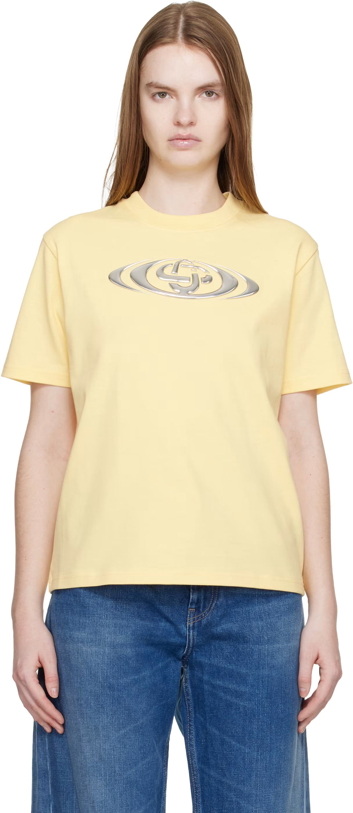
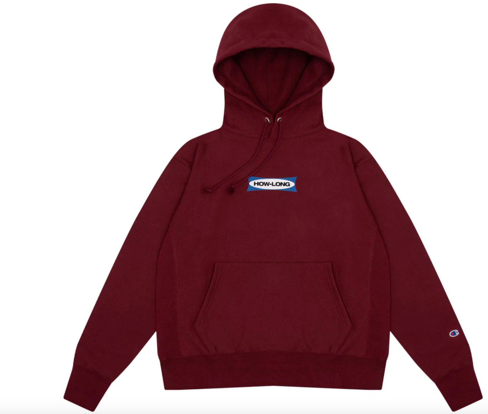
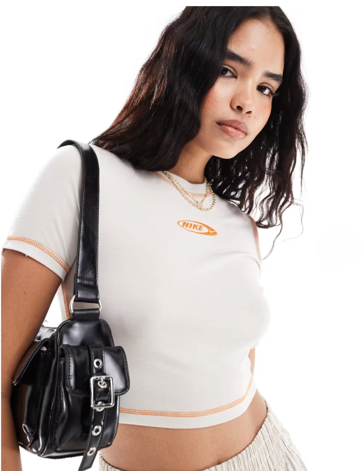
And…We’re Back. Ovals Circa 2026 🙃:

omg I loathed ovals and now I finally understand why. (I've been reformed)
Good one. Patagonia did it this season too.